

In order for a marketing campaign (any marketing campaign) to do well, it often needs to merge several different aspects together. For example, quality content and active social media promotion. Or targeted blogger outreach and an interesting affiliate program. But at the same time, none of your marketing efforts can be as effective without a quality, well-designed website. It’s the very foundation of your online presence and the key link between all marketing campaigns.
In this post, we will be looking at how good web design can help improve your content marketing efforts, and why content marketing backed by poor web design will not yield the same results.
Attracting more visitors to your valuable assets
There are nearly 1.8 billion websites on the internet. While you are certainly not competing against all of them, your target audience is exposed to over 50 different websites per day. If yours does not grab their attention in any way, you’re not likely to achieve much.
On the other hand, if you design a website well – if the website is unique, vibrant, and simply visually appealing – you have a much better chance of improving not only time on page but click-through rates as well.
Here’s an example: Sleep Junkie has designed a simple, yet very attractive website. There are no superfluous bells and whistles; their website is clean, colorful, and easy to understand. To keep the visitor’s eye entertained and interested, they’ve made sure to include plenty of custom imagery.
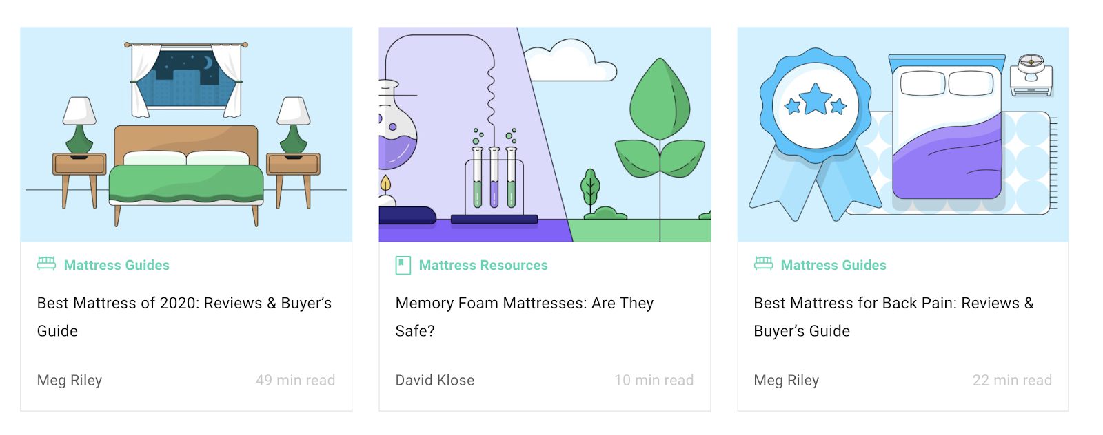
image source: sleepjunkie.org
Visuals leave a more lasting impression
Humans are visual creatures. What they see will remain in their memory for much longer than something they have read or even heard.
Images also have the ability to speak louder than words, as the famous saying goes. You may need 200 words to describe something and spark a particular emotion, and only a single image to achieve the same effect.
When you add appropriate (carefully chosen and high-quality) visuals to your content, you are instantly boosting its value. There’s a much higher chance the content will be genuinely appealing to your visitors.
Case in point: Ultimate Meal Plans. Instead of using superfluous words to describe just how amazing their recipes are, they say it with a photo, and the photo is incredibly effective. You can literally be tempted to make a meal right away.
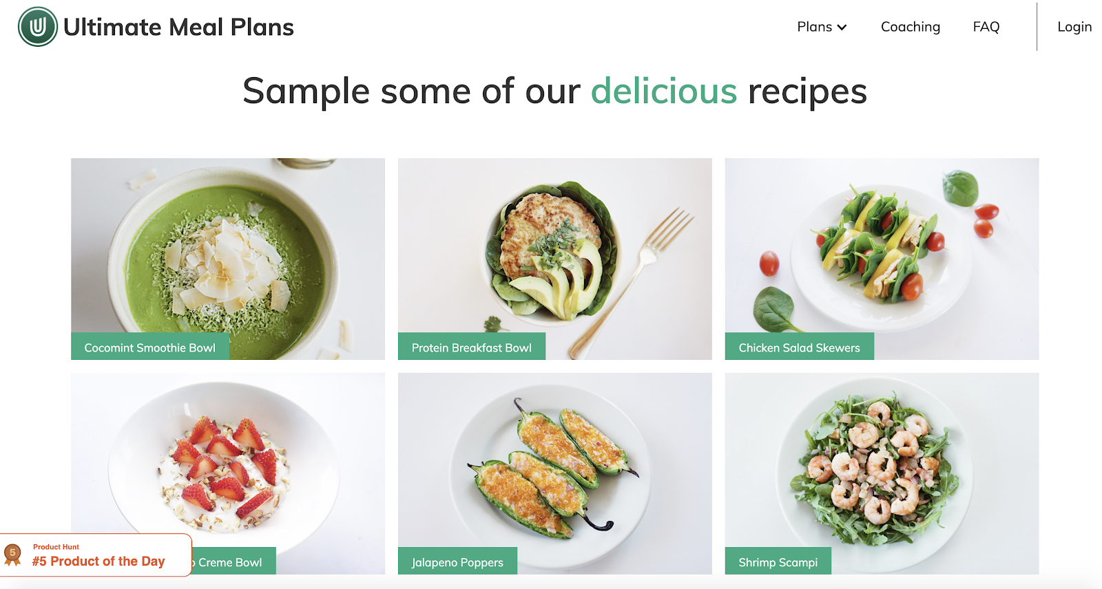
image source: ultimatemealplans.com
Even if your line of business doesn’t lend itself to imagery as easily as food does (for example, you work with numbers), there are still plenty of ways to add visuals to your pages. Think illustrations, screenshots, demonstrations.
Adding value to your CTAs
A cleverly crafted (both in terms of copy and design) call-to-action (CTA) can go a very long way. After all, visitors sometimes need to be prompted to take action, and this is where your CTA comes in to save the day.
We won’t even go into the option of not having a CTA. Let’s just explore how designing it well can help it go further.
If your CTA merely blends into the rest of the page, people aren’t as likely to notice and click on it. They might just scroll down further without actually taking it in.
On the other hand, if you make the CTA stand out, it will instantly draw attention and inspire people’s mouses to hover in that direction.
Here’s one such example: Startup Resources have a red CTA on a yellow background – instant success. It naturally pops, it makes that part of the page more exciting, and since we’re talking about the hero section of a homepage here, it makes it that much more effective.
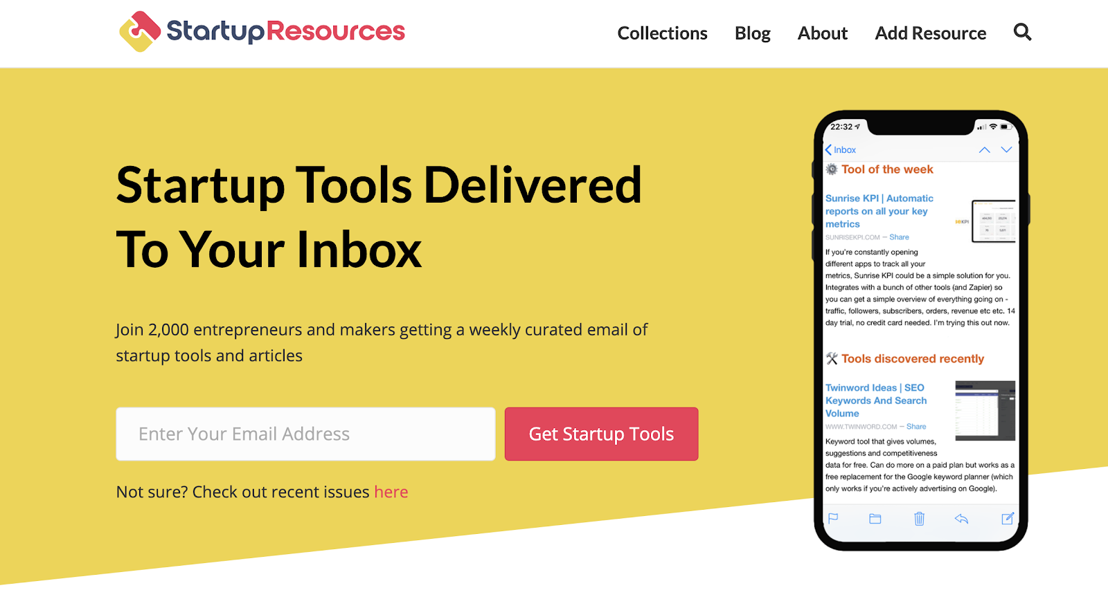
image source: startupresources.io
Bolstering understanding between your brand and your audience
Depending on the kind of product or service you have, users might need some time to understand what it is about, how to use it, and how it can help them solve specific issues. This is especially true in the SaaS industry, where a product might be just what someone is looking for, but they might not be sure it can do what they need it to do.
This is where visuals come in to help you out. By featuring demos, screenshots, and other helpful imagery, you can instantly help someone determine what it is they’re looking at (without having to read your copy), and figure out if this is what they need.
To help us illustrate this point, here is Vetter. They have included clever illustrations on their page to help users determine what it is the app can help them do. The app itself makes gathering suggestions from employees easy, allowing them to submit, rate, give feedback, and list challenges. On top of that, it also has a reporting feature.
See, it took me 29 words to write that out, while the page tells you the same in less than 2 seconds.
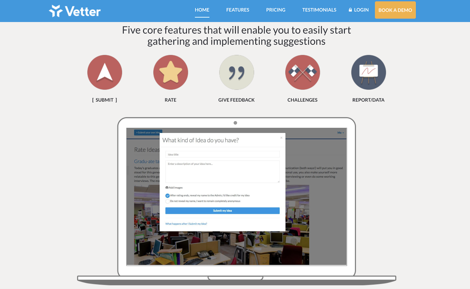
image source: getvetter.com
Building brand awareness
Naturally, images are a powerful tool for building brand awareness. They help you remain memorable, tell your story in an effective way, and reflect your values throughout all your content. In short, images help you get your message across more easily, and they enable you to connect with your audience.
This means that you need to be very careful when choosing the images that you want to feature on your website and that will accompany your content. They need to speak the same things your words do. So, for example, if your tone of voice is somber and serious, you don’t want to add colorful images to your website. It just wouldn’t work well, and the contrast would confuse most of your visitors.
Unless that’s what you’re going for – in which case, go for it!
A good example is the kind of imagery Orizaba Original uses on their website. The images are in line with their products and the vibe they’re going for. They are certainly memorable, and if you see a similar image elsewhere, you’re likely to think of Orizaba.
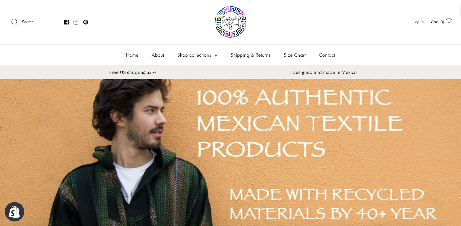
image source: orizabaoriginal.com
Repurposing content across different marketing channels
Sometimes, you just don’t have the time, or just don’t want to have to create a different image for different marketing outlets. In fact, using the same visuals across multiple channels can be a good thing, as it will help etch your brand identity deeper into the minds of your audience.
Of course, if you determine that most of your audience is following you across most of your channels, you might want to hit them with something new on each one. But since this is not often the case, you are perfectly safe with repurposing elements.
For example, you can take the images you used for a post and turn them into a slideshow you then publish on YouTube or even LinkedIn. You can turn a video you created into a bunch of still shots for your website or social media. And so on.
Crello does this nicely, and they even wrote an article about how to do it. They’ve compiled some of their content from the website, then repurposed and republished it across other media (such as Pinterest and YouTube), and it’s gone down well.
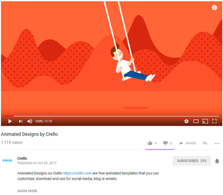
image source: youtube.com
Driving more sales with a bit of psychology
According to Don Norman, our emotional system consists of three interconnected layers: the visceral, behavioral, and the reflective.
The visceral level is in charge of those practically animalistic qualities of our behavior, almost entirely out of our control. The behavioral level denotes the controlled actions we engage in, where we make conscious decisions and look for the best course of action to achieve a desired outcome. The reflective is all about conscious thought and learning new things.
If we keep these three levels in mind, we realize it is possible to design websites that appeal to either of these levels.
In visceral design, we focus on how the visitor will feel when we show them an image. Behavioral design deals with usability, focusing on practical aspects of a product and how we might use it. Reflective design tells stories and makes people think about a certain product or service.
Baselang clearly had these levels in mind when designing their pages. They play on parts of all of these levels – they inspire calm and simultaneously make us think about learning a new language and what that would entail.
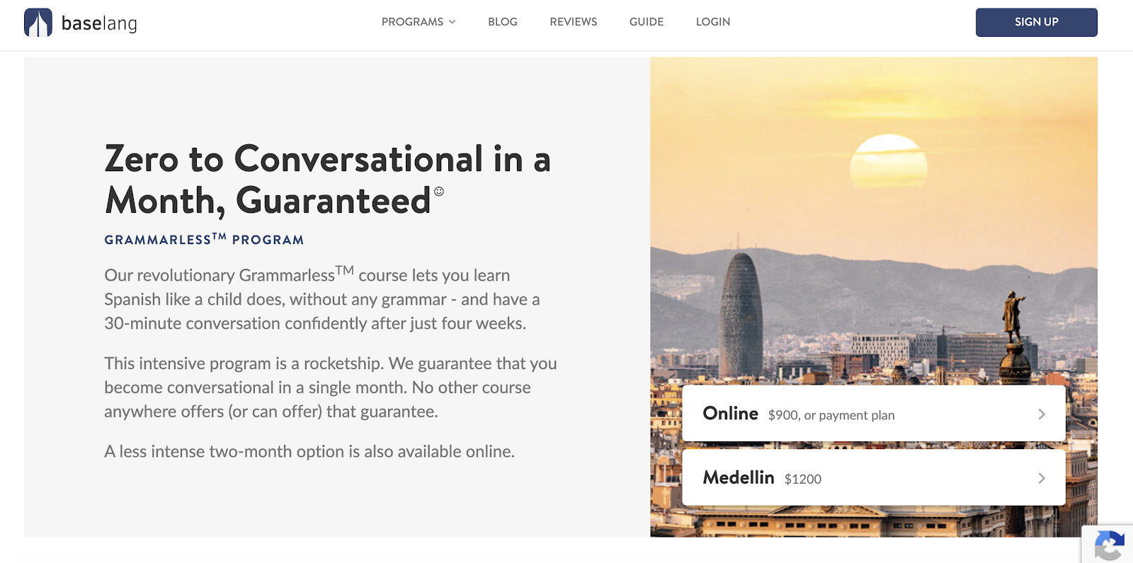
image source: baselang.com
To sum it all up
As you can see, design and content creation (and marketing) go hand in hand. One serves to highlight the most prominent features of the other, and vice versa. So before you run your next content marketing campaign, think about the design that’s backing it, and consider how you might be able to improve on it.