Introduction
This is a Bootstrap 4 Tutorial for beginners. The idea for it comes from “24 days of Rust” and “24 days of Hackage“. As the titles might suggest, this kind of article series features daily blog posts with tutorials on how to use a language or library.
14 Days of Bootstrap 4 consists of daily tutorials focusing on basic parts of Bootstrap 4. Each article has coded examples and extensive descriptions. We also recommend extra resources that you can use to dive deeper.
The purpose is for you to learn something new everyday. At the end of the series you will be a well-prepared Bootstrap 4 developer, ready to create any website that you desire.
The time commitment for each tutorial is about 1 hour a day. This may seem like a lot but I assure you that it will save you time in the future. Learning how to do things right (“by the book” – or by the Bootstrap documentation in this case) will help you cut down the time for debugging.
What is Bootstrap 4?
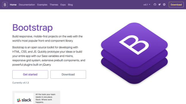
Bootstrap 4 is a toolkit (or library or framework) of front-end components for websites. It provides multiple utilities and components for writing responsive websites. Working with the Bootstrap 4 components instead of writing your own is a lot faster. We have written a blog post a while back about the benefits of Bootstrap and advice from people working with it.
Everything in Bootstrap 4 is mobile-first and scales up to bigger screens. This means that the pre-built components and the grid system were created writing first the styling for the smaller screens and then changing it for bigger screens. This is different from the usual style of writing for bigger screens and then modifying it for smaller resolutions. We will have descriptive examples for this in the next days.
Bootstrap 4 is easy to customise. Bootstrap 3 and 2 might have been seen as prototyping frameworks (the old saying that “all Bootstrap sites look the same” is pretty popular). But Bootstrap 4 lets you modify most of the settings, making it your own.
So, if you have an application that is heavy on the back-end and you just want a basic interface, Bootstrap 4 is a great candidate. And if you want a fancy front-end, Bootstrap 4 will also be a good choice because you can customise it. One of best features of Bootstrap 4 is the fact that you can create your own design while enjoying the grid and utilities.
Bootstrap 4 is a great tool for front-end development. With the help of this tutorial you will be able to unlock its power and start developing beautiful and responsive websites.
Bootstrap 4 Requirements
Before trying to learn Bootstrap 4 you need to be familiar with HTML and CSS. If you have not worked with them before please check out the tutorial links at the end of this blog post. These are required knowledge before diving into Bootstrap 4.
To understand the full capabilities of Bootstrap 4, you should also know JavaScript and Media Queries. Javascript lets you add dynamic actions to your page (e.g.: make things move, add triggers when something happens). Media Queries give you the possibility to add CSS styling only if a certain condition is true (e.g.: if the screen has a certain resolution, if the screen is in portrait or landscape mode).
You can understand the basic concepts of Bootstrap 4 without writing JavaScript or Media Queries yourself, but we recommend you give them a try.
If want to add Bootstrap to your belt, then let’s get started with the first day!

Photo credit to
The Days
- Day 1: Bootstrap 4 CDN and Starter Template
- Day 2: Bootstrap 4 Grid Tutorial and Examples
- Day 3: Bootstrap 4 Flex Tutorial and Examples
- Day 4: Bootstrap 4 Typography Tutorial and Examples
- Day 5: Bootstrap 4 Images Tutorial and Examples
- Day 6: Bootstrap 4 Buttons Tutorial and Examples
- Day 7: Bootstrap 4 Inputs Tutorial and Examples
- Day 8: Bootstrap 4 Forms Tutorial and Examples
- Day 9: Bootstrap 4 Tables Tutorial and Examples
- Day 10: Bootstrap 4 Navbar Tutorial and Examples
- Day 11: Bootstrap 4 Navigation Tutorial and Examples
- Day 12: Bootstrap 4 Lists Tutorial and Examples
- Day 13: Bootstrap 4 Cards Tutorial and Examples
- Day 14: Bootstrap 4 Modal Tutorial and Examples

